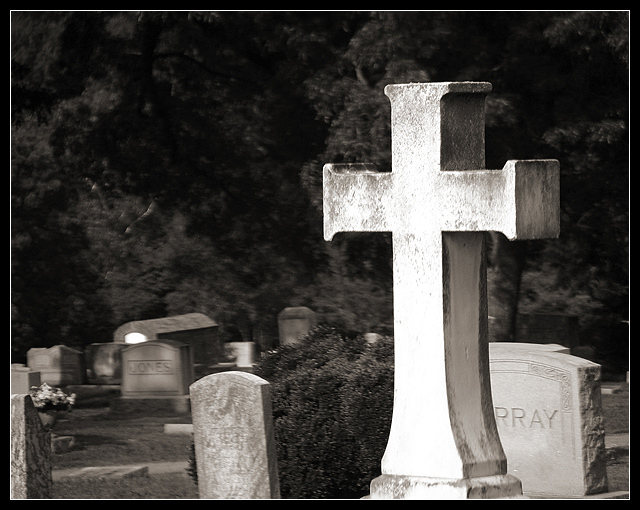
Not sure I like this one so much - the out of focus regions just seem blurry to my eye - maybe gives me a ghostly impression or being dead, but doesn't quite work for me. The foreground cross is a strong tonal contrast to everything else, but it would maybe look better with a less over exposed look that kept some more of the texture ? The jumbled composition just feels haphazard and accidental - particularly the occluded 'murray' headstone on the right - I can't tell how much of this was intentional to make it look cluttered vs. accidentally arranged.
Glad to see you in a challenge once in a while, John! I see you're still showing us how it is done! Super work. I like the use of light here with the cross so light against the dark background, and the dof really works well for me. Really nice.
I like the concept here, but the shot just doesn't "feel" right to me. Enough of the shot is out of focus that it makes me feel as though my eyes can't focus properly. The glaring brightness of the cross, and the lightness of the stones near it make the shot feel somewhat unbalanced to me since the other side is so dark, and doesn't seem to add anything to the shot. Perhaps a tighter crop on the cross and the stones behind it would have more impact.
Great shot, and a nice take on the challenge! I especially like the subdued tones and feeling imparted by the desaturation and sepia tone. One point of distraction is that the headstones in the background are a bit out of focus-- rather than completely out of focus, or razor-sharp. Perhaps either a shallower or deeper DOF might have served the shot a bit better. --8







 Add photograph to your favorites
 Add photographer to your favorites


