Author Thread
Post actions
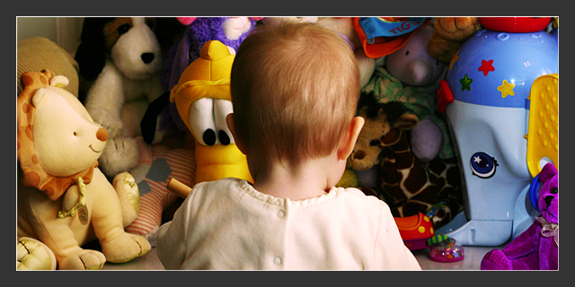
I agree that a little more angle of view would have added to the photo. However, I think the head being dead center helps convey the "surrounded by choices" concept. I really liked this shot even with the close cropping.
Comments Made During the Challenge
Post actions
Adorable. I wish the image were larger and also that there was a little more headspace in the crop.
Post actions
Post actions
Post actions
Nice idea. But back of head is too in-your-face. A composition from more of an angle with at least a profile would be better.
Post actions
Would have rated it higher if the baby wouldn't have been positioned so dead center. Try playing around with rule of thirds. Love the color and the lighting technique.
Post actions
Cute! I like how the baby is turned away from the camera. Good title, too. Well done.
Post actions
Cool shot, looks like one you would see in a Doctors office. would make a cool poster.
Post actions
Post actions
I like the crop and the view. It is like we are seeing what she is seeing. Good
Post actions
Post actions
This is sweet. I'm not crazy about the border, takes a lot away from the child- my eyes are drawn out. This would be nice in b&w also.
Post actions
lol I was thinking of doing the same thing but my kids dont stay still haha






 Add photograph to your favorites
 Add photographer to your favorites

 Photographer found comment helpful.


