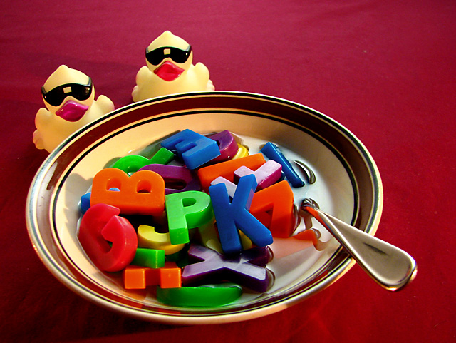
This image has many strengths, not least among them the absolutely gorgeous lighting on the flatware. I mean, really! Conceptually, it's also very strong. What I do NOT like as much is the desaturated-looking yellow of the duckies, and their unnatural beak color. I have a couple duckies like that, and they are hard to shoot. I have a couple other duckies that are much MORE yellow, and they are a joy to work with.
Finally, the BG itself is unfortunately quite uninspired, a rather insipid color and very flatly-lit. If it were advanced editing, you could solve it by burning in from the upper right along both edges with a gradient, but that wasn't an option here. Better control of your light would have done the trick, to allow the BG to shade off to dark upper left; a "pool of light" as it were...
I wasn't going to enter this. Even with all the toys my kids had kept I was uninspired in how to capture them in an interesting way, and I finally did this more as a challenge to myself to work on lighting and details.
It was set up on my kitchen table at 1am, and woke poor hubby with the smoke detector while boiling the kettle for "soup" steam. (Grr, kids need to learn to clean up when they spill stuff in the burners!)
And then I took so long mucking about that the water cooled and I didn't get the steam showing anyway!
I'm not happy with the lighting yet, wasn't sure about the background colour choice, the composition, but decided to enter it (on daughter's urging) in hopes that I might get some comments to help me improve it.
Well, I guess I wasn't bad enough for those! Thanks to all who did comment :D




 Add photograph to your favorites
 Add photographer to your favorites


 Photographer found comment helpful.


