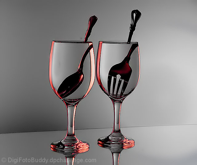
25th is a very respectable placement. the only downside to this one is in the processing - it's a little oversaturated, and either the compression or the sharpening has caused some artifacts and disturbed the clean lines that make this image. I would bet that the full sized version looks spectacular.
a couple of things to avoid this (and you may know this already, but I don't know how familiar you are with photoshop, so bear with me if this is old news):
1. sharpen your image last - AFTER resizing
2. when you resize, use 'bicubic sharper' as your compression algorhythm (in CS and CS2) or use the stair interpolation method (gradual 10% decreases in size rather than one big drop)
3. make sure your colour space is set to sRGB when editing, as that's what viewers see on the web.
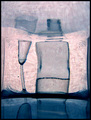
the only other thing that throws me off in this one is the horizon - neither the table nor the glasses seem level.
otherwise the concept is perfect for the challenge, and the setup is very clean and pleasing to look at. very solid entry.
The image design is so clean that the sensor spots and/or dust stand out a mile and detract from the whole effect. Having said that, I do like the approach and the colour very much.
Shail, congratulations on your excellent image! I'd love to know how you did it. The clarity of the glasses (and they're so clean!) really stand out. I like the color a lot, too. For the "constructive" criticism, I do agree with two commenters below that it would be interesting to see a closer crop and the sharpening was possibly one step too far. The sharpening is most evident with the slight glow around the fork and spoon. But this is really a great image and worthy of a high score! WTG!!
Love the pinks, the exaggerated images of fork and spoon here. I cannot imagine that this is really what the camera saw, at least not in one image, anyway, but the spirit of refraction is tremendous!!
The wonderful graphic greys, the shading, the subtle contrast and shading is lovely to behold. I would love to see this in it's original size, but as it is, it is a read treat to see
this should do really well, the red really picks this up and the spoon and fork really answer the challenge...could it have done with a little side cropping? maybe a sqare crop with a black frame would have lifeted it a bit???





 Add photograph to your favorites
 Add photographer to your favorites

 Photographer found comment helpful.


