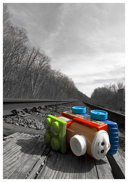
A railway crossing at a rural road in Milton, Ontario, and a pre-schooler's toy bought at a department store the day before. I got this idea as soon as I saw the challenge. Using a map book to find local crossings, Alex and I drove around for about two hours until I saw the crossing that would work.
This image was post-processed using only adjustment layers (mostly hue/desat) and usm. I knew this was going to be a selective desat, so I picked a really brightly coloured toy, and a really drab railroad crossing. :) It was simple to make such a bright object pop out of such a grey scene. There was a lot of yellow in the scene, so the bulk of the desaturation is done with yellow, with 100% lightening of the yellow. I lost the bright yellows on the face and smokestack of the toy, but gained an interesting lighting effect. Managed to get rid of the blue of the sky by desaturating blue, but pumping up cyan to keep the toy's blue plastic bright.
Statistics
Place: 5 out of 300 Avg (all users): 6.4341 Avg (commenters): 8.3846 Avg (participants): 6.0706 Avg (non-participants): 6.6917 Views since voting: 3385 Views during voting: 337 Votes: 205 Comments: 34 Favorites: 8 (view)
I'm not sure why but I find this picture hilarious. It's very dramatic and well done, and at the same time it reminds me of how as a little one I used to take toys as "the real thing", and would try to imitate reality with them.
The desat really works for this image as my attention is immediately drawn to the toy. It fits the challenge well and finished great! Congrats on this shot!
I love this shot. You really have a great sense of humor and it shows in this image. Good composition, DOF, everything just comes together cleanly in here. Good job.
I liked this shot alot. I gave you a 7. Great angle and perspective. I think you would have done better leaving some of the color in the background - just a light tint of color. Outside of that I am not quite sur ehow else to improve this. Good idea. Made me smile. I think had it been an advanced editing challenge you could have done some cool stuff with colors onthe rails and wood. Great job.
This is a brilliant photo. The clarity in the background, with Ansel Adams'-style b&W works really well against the bright colours of the train - special kudos when you remember its basic editing.
I think the selective desat works particularly well here because the background is not expected to be very colourful, and has a lot of texture.
Everything is crisp and sharp which is nice, and always helps to maximise a score here ;)
The slight tilt to it really adds to the atmosphere created - gives it character and supports the title/context. Composition is good, the negative space above seems to lend more weight to the sense of the converging lines 'disappearing' into the distance.
Creative idea for the challenge, very well executed. Nice and quirky, and you've not been tempted to over-saturate the coloured parts.
Not really sure of any criticism - maybe the railway building on the right gets in the way a little if I'm picky
this is a beautiful image, too bad that toy is in it ;) I think selective desat doesn't work in the benefit of this image, it makes the toy stand out too much, but it could look good either all B&W or all color.
you might have made the toy worn out and dirty to, it looks too clean to be left on the rails.
this image is nicely lit, composition is good and did amazingly well in this challenge.
This is a clever idea well executed. I like the perspective established by the lines where trees meet sky. They vortex in a point that leads right to the toy. I don't know if that was intentional, but it works for me. I also like the tilt to the picture. It adds movement to the now derailed train/toy. This is a very good example of desaturating a picture - especially graying out the sky while keeping the blue in the toy. I hope Alex had as much fun that day as you did.
Very nice use of crop to almost eliminate the building on the right. That's well done. The leading lines are present here, but they pull my eye away from your subject, instead of to it. That's unfortunate, and it's part of your concept, so I don't know how to prevent it. I'm not a huge fan of selective desaturation, but this is well done and gives a nice effect.
I gave you a 7 in voting for this challenge. It was very well done (and congrats on the 5th place finish!). The only thing that kept me from going higher is that the toy seemed to be lacking in color (after reading your info, now I know why) since I know how bright those things are. But your focus and DOF are excellent. I especially like the skewed perspective.
This was one of my favorites in the toy challenge. Great composition and perfect focus. About the only thing that I would have changed is perhaps geting beyond that building on the right hand side. Great capture!
Thanks for all the nice comments! GeckoZ, and to others who've asked: it was done entirely with adjustment layers, the most important being hue/desaturation, which is legal in basic. Other than the colours in the toy, the picture was mostly yellow, so it was simple to get a b/w look simply by desaturating yellow completely.
Edit: Thanks Louis and glasd2badad (who emailed me to explain why this processing wasn't illegal). My mistake for not reading the details clearly. Thanks again!
wow! this is so great. creative and emotional, and i can't figure out how you achieved the color the way you did, after all this is basic. i like the slight shift in camera angle, it adds to the overall feel. blue winner for sure!!
Very nice leading lines. Love the colorized train vs the b/w of everything else. Generally I do not like titled things but I think it works very well here. I have you an 8 and good luck.





 Add photograph to your favorites
 Add photographer to your favorites

 Photographer found comment helpful.


