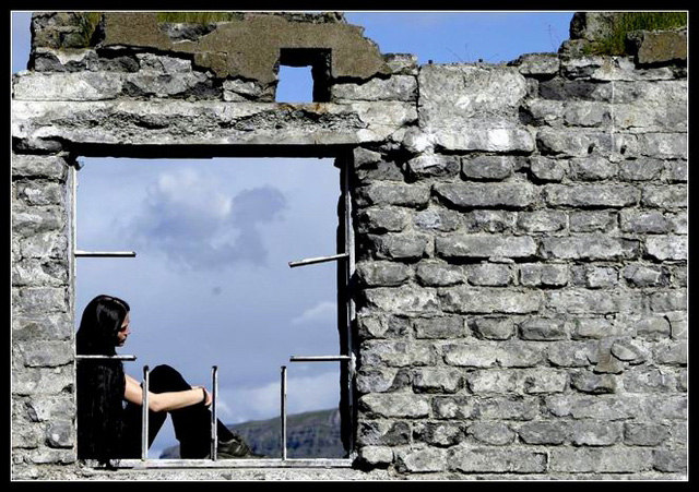
I love the framing of the shot... The "ruble" visible in the top of the picture really adds to the broken window. It's shots like these that inspire my newbie interests into photography!
It would have been nice to have a 100% sky in the window background, but I think it's fine the way it is now!
This is my favorite of the pictures in your portfolio, there is a richness of the colors. (I tend to find a lot of your images dark, and my personal preference is a range of colors)
Ef fólk myndi fatta að þetta hefði verið verk LjósNyndara en ekki ljósmyndara þá hefði þessi mynd slegið öll met, erfit að vera misskilin. Til lukku með hið "skemmtilega" fjórða sæti
Excellent shot Nazgul. Just wanted to welcome you to the 4th place club. Bet you're frustrated right now. I got 4th place on the first photo I ever submitted here. That was months and months and months and months ago. I haven't done better since, still no ribbons for me. :( I wish you better luck after your 4th place finish than I had. Keep up the good work.
Very very good shot. I love the fact that you left he blue in above the window frame. It adds a whole new element to the pic that would have been lost with a tighter crop.
I really like the way the broken bars in the photo are almost acting like pointers/arrows saying "look here!" Lots of right angles in this shot. My only comment is about the lack of detail in her outfit -- it all seems to blend together with hair, but I realize this is hard to get when shooting against a bright sky and then reducing it to "web size". Nice job.
My favorite. It uses right angles and stark lighting to poignantly portray what it must feel like when a family breaks up. I like the contrast of the clouds in the windows and the blue sky above the wall. The one bar in the window frame that isn't a right angle points toward the girl's head, leading my eye in that direction; did you do that on purpose? Dividing the image in half isn't conventional composition, but it works great here. The girl's posture and expression are perfect. I don't care for the frame, but it doesn't detract from the photo.
WOW !! Love the composition and the light in this picture - The off centre placement of the model is very appealing. one minor nitpick the edges show artifacts from excessive sharpening though [9]
I really be interested to see this photo balck & white. I think it wood set more of a mood. Good right angles and nice touch with the subjest sitting in the window! You really could have some nice contrast in this shot!
The more I look at this the more I like it. For me, the one beam in the window that's slightly crooked draws attention to the right angles in the rest of it, very fitting for the title of the challenge. I'm curious to know where this was taken, too.
Nicely done! I'd like to suggest some sort of improvement to make it better... but I can't think of a single one. You seem to have thought of everything. Nice shot!
Hmmmm... I wonder what this photo would look like if tweaked to look a little more like //www.dpchallenge.com/image.php?IMAGE_ID=12218 or //www.dpchallenge.com/image.php?IMAGE_ID=12933. Just a thought.
I like it though.






 Add photograph to your favorites
 Add photographer to your favorites

 Photographer found comment helpful.


