|
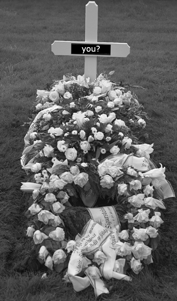
The shot isn't bad. The biggest problem here is that your photoshopping doesn't flow with your photo. Your shot has almost entirely midrange tones, but the piece you added is straight black and straight white, which makes it stand out from the shot as unnatural. The font you used seems like a poor fit as well. The result seems to be a solemn shot with a somewhat cheesy tag added to it, leaving it quite unbalanced. If your intention was to create a contrast by adding a lighthearted tag to a heavy shot, that's a different matter entirely, but I didn't get that impression. |







 Add photograph to your favorites
 Add photographer to your favorites


