Greetings from the Critique Club!
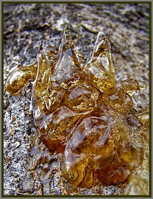
This is an interesting shot - I like the warm colors in front of the cool, monochromatic background.
The image does not really stand out or pop very much though. I think part of this is the lack of significant texture in the bottom part of the amber. I am not sure if this image could have benefitted from a deeper depth of field, or maybe simply a tighter crop on the upper part of the amber. With your particular camera, I am not sure if you could have done that. But what I see is a lot of the texture of the amber being lost in the bottom section, which is a bit of a shame since the texture is the overall theme. I hope this helps, and that I did not sound too critical - overall I do like the shot.
-Rich |





 Add photograph to your favorites
 Add photographer to your favorites

 Photographer found comment helpful.


