i like it.. and lol i was just wondering why nobody mentioned the jaggies and saw your comment... i think your solid composition pulled people past that
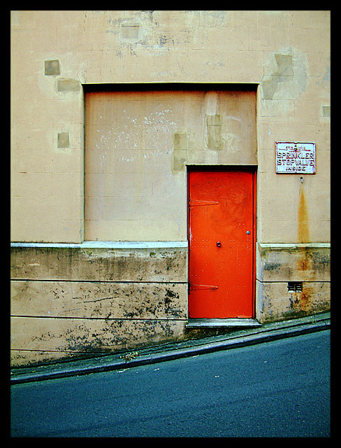
I was worried that this pic was going to get slammed for the jaggies on the diagonal gutter...
This is my first DPChallenge so thanks for all the feedback on my pic. It was great fun!
I´m a very bad commenter but I couldn´t pass this one without saying something. This is SO good. My absolute favourite in this challenge. The colors are fantastic and the composition just perfect. This is a winner! Good luck!
I really like this and would probably buy it as a postcard in an art shop. Just great colour and composition and I love the combination of bright and chirpy with gritty and mundane. The angle of the road really strengthens the impact of the squares and rectangles.
lose the frame, frames distract me for the the most part as a rule, sorry it's a quirk of mine. Now The angles here are great, like the colors, especially the red door. I would have made a right angle of the black street (?) at the the bottomas well. I see that the shape corresponds to the wall immediately above the black, but I do not feel the repitition of the shape is necessary.
I like how the hill is sloping down and the door is a bright orange. Leads your eyes right to the door. What would have made this perfect is the blueish tint in the picture, but I glad you didn't photoshop it for contest.
Great shot. An intelligent use of contrast. I like the diagonal. It complements the inset rectangles very well. Knowing this site, I'd be surprised if this won, but I hope that it does very well. 10 from me.
i love it. concentric squares. the use of border was very effective. the strength of the right angles definitely overpowers the slope of the road. perfect interpretation of the challenge. good focus and compositionally excellent. could use a tiny bit of exposure compensation though. 9 !!!





 Add photograph to your favorites
 Add photographer to your favorites

 Photographer found comment helpful.


