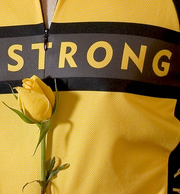
My jersey, with me in it. I was testing out some lights I borrowed to take pics of a friend the following day. I would have used one of those shots of my friend - some are really nice - but I didn't want her to suffer for my inadequacies as a photographer. :-)
Post note: The rose does have significance - in the fall, there's a ride sponsored by the Lance Armstrong Foundation called "The Ride for the Roses" in Austin. It's a fundraiser but named based on a "race" that Armstrong and his buds used to do, for which the prize was a dozen roses, or so the story goes. And the roses are yellow, since, well, it's Texas. For those interested in more info, see www.laf.org Now that Lance is retired, there will be seven such rides this year throughout the US.
Crop, slight tweak in exposure, USM, resize, USM.
Statistics
Place: 166 out of 404 Avg (all users): 5.3693 Avg (commenters): 5.6667 Avg (participants): 5.2901 Avg (non-participants): 5.6000 Views since voting: 950 Views during voting: 226 Votes: 176 Comments: 15 Favorites: 0
Really like this image, love Lance, the rose adds a really great contrast from the bold STRONG. Not sure how you could have improved the image, maybe a little different lighting, but not really sure. Really little thing, but the zipper bugs me, wish it ended in the dark line above instead of cutting the "T" that way, but maybe the line of the closed zipper through the "T" was more distracting. Overall really like this one, well done
I think it was you who mentioned in my Yellow entry that you thought about shooting something similar. Well I thought about shooting something like your photo. Over where I live there are lots of cyclists who like to train on the road nearby my house and many of them have team jeresys with yellow in them.
Very yellow and very crisp - mostly. The rose, while beautiful does not have as good a focus as your jersey (?). I think to make this shot pop, the rose should be a little brighter and sharper. All in all though this is a pretty shot. I like the subtle contrast between "Strong" and a delicate rose. Nice idea.
Think most has been said, only thing I could think of to try is along the lines of what eschelar said, but I would TRY to make the rose to "O" in S T R (Rose) N G, not sure if it could be done, but maybe if done well, would have increased your score a lot. My opinion, we understand! LOL
I was thinking that it would have been nice to have moved the rose up to the black strip to increase contrast and make it stand out more. Then I thought that it might have been fun to use the Rose as an 'R', covering it with the head of the rose.
The composition might have needed to change though with a slight turn to your right.
I'm not sure what 'Strong' means in this context, or what 'LiveStrong' means, or even who Lance Armstrong is! - So apologies for that. I can only comment on the technicals of the shot.
The lighting is fine, lit from the left with the rose pointing towards the light. Slight shadow falling across the jersey, but not so much to be distracting.
The main thing that doesn't sit well with me are the lines in the shot. Although the composition is fine in relation to the 'outside' frame, the lines on the jersey add a very strong framing element to the shot, which kind of puts everything else off-balance. There's a black line directly across the middle, and a strong black line down the right hand side, with nothing to balance it on the left.
For me, the word 'Strong' becomes the primary subject, with the yellow rose secondary.
I really loved this image. There's just something about it that seems bold, strong and clean. I am really surprised and disappointed that it only scored 5.3.
I didnt get the Texas relationship as well. Nice shot. I may have prefered a slightly more saturated yellow overall. Good composition and layout. Not much else I could suggest for improvement. But the most important thing is it's a wonderful shot of your jersey. (Wow - that sounded wierder than I had imagined). Good luck in Jump.
I must admit that I didn't get the yellow rose of Texas bit when I saw this one but this is one of those images that seems to have everyone thinking - which is a very good thing in my mind. Maybe the lighting is a little harsh but a fine "image with a message" shot none the less.
I like this. Somehow the dark lines look a little grainy, but I don't know if that's the fabric or the photograph. This has a nice abstract feel to it, even though like the other commenter I don't know the significance of the yellow rose.
Focus is excellent. Color is nice, though a little bit washed out in some areas probably because of the lighting, which is good but maybe a smidge harsh. Its an interesting image, the rose seems a little out of place to me, but I don't know much about the LiveStrong foundation so maybe there's a significance I'm unaware of. If it was added to give more elements to the image, I'm not sure it succeeded since as a viewer I think it looks odd. Still its nicely rendered and just the shirt may have been too barren. A solid image. 6
Nice jersey
Extra points for the cycling reference
Extra extra points for Armstrong reference
The only thing that would make it better for me would be if it was a action shot, instead







 Add photograph to your favorites
 Add photographer to your favorites

 Photographer found comment helpful.


