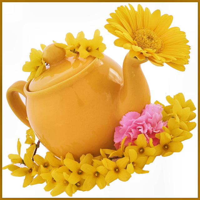
Really cute idea, like the composition, the angle really adds some interest. Like how you included the pink flower to give it a little contrast. I wish the pot had not been so reflective and maybe just a wee bit sharper would have helped too. Overall nicely done.
This one is appealing for a couple of reasons (to me, anyway) - the angle is different yet not disturbing, as moving things to an odd angle can be sometimes. The tone of yellow and the composition are very "uplifting" creating a warm, cheeful type image. And the "pink" adds an element of additional interest. All that said, I think it needed a little less border, and a bit (just a bit!) more contrast, maybe.
Most has been said and said well by others, overall nice image and good idea, nicely captured. The only thing I would add for ME, wish the background was not quite so harsh white, too much for these old eyse! LOL Tilt is also not my favorite, but to each his own, as someone said before me! LOL
This is a cute idea, prettily composed, and well-shot. It's nice and sharp. I honestly think it would have done fine without the pink in it; I actually had to go back and look for it once I saw the title.
The delineation between the subject and the foreground (white) seems a little harsh. While I am not an advocate of the tilt gimmick, I don't think this shot is hurt by it.
I would have to agree with some of the lower comments. A little soft in places and the white underneath the shot seems a bit odd. I think some shadow would have helped underneath. Overall I liked the shot and gave it a 6. The two shades of yellow between the teapot and flowers were a good match (and the pink was a good spot of contrast in the color).
Wow. Don't let anyone say you don't meet the challenge. Hehe. I like the composition for the most part. The flowers are very nice as is the teapot. The combination of the two makes for some nice interest. I'm not sure I like the white background. It seems a little too much and makes the subjects feel like they aren't grounded anywhere. I do like the tilt of the subjects though. I could see this being a nice stock picture as well, it is technically nicely done and has a bit of whimsy. Not a fan of pink so I'm not too sure if I like the carnation or not. it does add a nice punch and breaks up all that yellow. The focus is also a little bit soft in some areas, not sure why though. 6
Bright, cheerful and sunny are the words that I would use to describe this composition. This photo is very much springtime picnic with a cup of tea personified:-) Yellows are bold and vibrant and that splash of pink just adds another cheerful spring color for visual interest. The reflections on the teapot are a tad distracting and a good polorizer lens would eliminate those reflections. While the white background helps make the main subject stand out it creates a stark and sterile feel that is the exact opposite of the cheery, springtime mood you are creating with the flowers & teapot. Perhaps another color that is readily associated with spring would be a better compliment to the main object present in the photo - say a solid mint or grass green background - perhaps even a bright checkerboard pattern that children's artist Mary Engelbreit is fond of using in her borders would help boast that springtime bright colorful presentation seen in your photo.





 Add photograph to your favorites
 Add photographer to your favorites

 Photographer found comment helpful.


