Man oh man :) Thanks a bunch for all the great comments. I usually don't go so extreme on the post processing but because of the no editing restrictions for this challange I decided I had to.
The History: I took this photo in the Vestfjords of Iceland while on a trip visiting my relatives that live there. This man was a part of an outdoor museum about fishing in the old days.
Editing steps: Worked on different areas with adjustments layers. Brightness/Contrast, Levels. Added a layer and used soft light and lowered the opacity. At the end I added another layer on top and made it bw and used variations to make it brown. Then instead of soft light I used hue and the picture got this brownish/old feel to it. Lowered the opacity a bit.
Statistics
Place: 1 out of 201 Avg (all users): 7.7581 Avg (commenters): 8.7407 Avg (participants): 7.2391 Avg (non-participants): 8.2660 Views since voting: 24153 Views during voting: 408 Votes: 186 Comments: 74 Favorites: 68 (view)
Amazing post processing work on this one. Looks almost like a painting. Very well balanced tones, great composition, a perfect pic. Very worthy of the blue. Congratulations!
Congrats Árni. Thanks for the info on post processing. I really like the composition and the balance, the placing of mountain on the other side of the fjord is brilliant. Your post processing helps to make the most out of the original. Very good work.
Man oh man :) Thanks a bunch for all the great comments. I usually don't go so extreme on the post processing but because of the no editing restrictions for this challange I decided I had to.
The History: I took this photo in the Vestfjords of Iceland while on a trip visiting my relatives that live there. This man was a part of an outdoor museum about fishing in the old days.
Editing steps: Worked on different areas with adjustments layers. Brightness/Contrast, Levels. Added a layer and used soft light and lowered the opacity. At the end I added another layer on top and made it bw and used variations to make it brown. Then instead of soft light I used hue and the picture got this brownish/old feel to it. Lowered the opacity a bit.
If you need some further information about this e-mail just send me an e-mail or personal message. Thanks again :)
Congrats Arnit. This it quite different for you, thought it was JJBeguin's. My fav of the bunch. Would love to read your edits for this shot and see the original!
I am so pleased on your blue. Well done. It was, for me, an outstanding entry to this challenge. I just don't understand how some people couldvote a 2 or 3 for this.
Love the textures and the tone. Composition very well done. A little over-edited for my tastes - his face doesn't look real, but this will score well at DPC. 8 - good luck in the challenge!





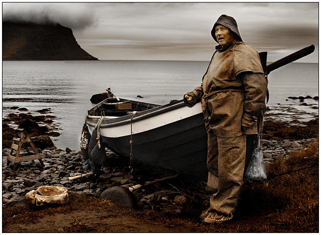
 The Fisherman
 Add photograph to your favorites
 Add photographer to your favorites


 Photographer found comment helpful.


