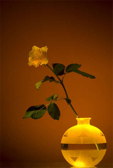
I absolutely love the hues of the yellow of the vase and the deep, rich, warm orange/brown of the background. These color hues and eye-catching and enchanting and really make the image capture the viewer's attention. The crux that brings this composition down a notch back into the good category is the fact that the yellow of the rose is poorly illuminated. All other aspects are well lighted and in wonderful focus, but the rose falls into some shadows and as such the illumination is not as bright as it could be. The rose needs to pop off that orange/brown background just like the vase does but it does not. If the rose was lighted better such that we could see the vibrant and rich yellows of it's petals then this composition would move from good to extraordinary.
Neat vase... Will return to comment later 'cause I'm still trying to decide on this one. There's something very odd (and interesting) about the flower. :)





 Add photograph to your favorites
 Add photographer to your favorites

 Photographer found comment helpful.


