Taken in August 2002 while working in our Los Angeles office.
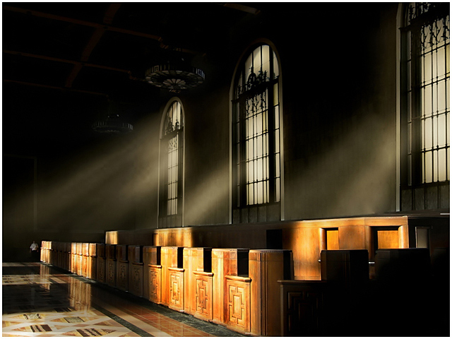
It took more than two hours to edit this puppy. I added the light rays in PS. I will most likely do a tutorial on how to do this technique. I think it adds to an otherwise drab image. I've always thought of old train stations as smoky, dark, and mysterious. I just made my vision a reality using PS. The resolution was bad and the image was less than stunning. Pulled out all the tricks for this edit. I hope it just does well ;)
-----------------------------------------
Post Challenge Comments As Robert said in his comment, Welcome to the "I scored a 7+ and didn't get a ribbon" club!
I knew this challenge would be a high scoring challenge. But I guess, it`s not bad for a little P&S with the help of some Photoshop magic. I will be posting the original soon and will write a tutorial regarding creating false rays of light and make it convincing.
Thanks for the great comments and the great score. I`m glad I have a shot that isn`t a landscape in my profile page :)
Here is the original shot:
How did I do it? I have written a tutorial about this process but since this challenge had no editing rules, the tutorial wouldn't help much in future DPC entries. If you would like a copy of the tutorial, please PM me your email address and I will send you a copy in PDF format.
Disqualification Details
Any attempts to alter the point totals in any way for any photograph will result in immediate loss of account and a ban from the site. Photographs by any participating parties may also be removed from past or current challenges.
Statistics
Views since voting: 2980 Views during voting: 352 Comments: 30 Favorites: 2 (view)
I keep coming back to this image- I love it!!! But also to check if you've done a tutorial. You do those rays of light so well- keeping the image intact perfectly, they seem so natural. You should really do a 'how'd they do that' or something because this is simply stunning. adding to my faves (why wasn't it there before I ask?) :0)
"Rays of Light" is an amazing entry into the Best of 2002 challenge. I am amazed looking at the differences between the original and entry, you did a great job. It seems so wrong to receive a 7+ and not ribbon, like others have said. .
This is an excellent piece, it is cropped just perfectly. The angle is very nice is creating the atmosphere. The rays of light are so fitting for the church environment. There is not much I can comment on because you did such excellent job. Congrats on the score and of course I look forward to all of your future entries.
nice image, Rikki, but what about "adding a major element" clause?! It's got to be pretty major if the title is "Rays of Light"...
There were special Advance Editing rules in this one which basically said there were no rules except you couldn't splice multiple images together.
Oops, my bad! I did not take part in this challenge (did not have any original files from 2002), so did not pay close attention to the rules. Congrats on the fine image and the well deserved high score then! :)
8 - Nice. Tweaking of the colors and 'rays' (somehow) and a more finely tuned crop, especially at the top, may have made this even better, in my opinion.
Wow! The lighting in this is great...
I can't decide if the person adds to, or takes-away from the image...so I'll split the difference and say it has no effect. :)
Great shot.
Wonderful image and great post-processing! I love the whispers of light cascading through the windows and the richness of the floor colors and wood. Very nicely done!





 Add photograph to your favorites
 Add photographer to your favorites


 Photographer found comment helpful.


