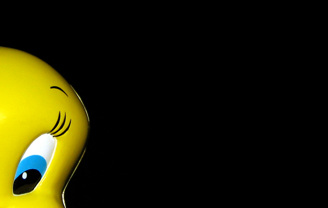
Play on words using the alternate definition of Yellow, meaning cowardly. Tweety fits the bill quite perfectly as he is not a chicken, but is always running away from Sylvester.
This isn't exactly the shot that I had in mind, but because of circumstances, including time and wrestling with the camera's limitations, I had to make do with what I had.
Technically, I was quite happy with this particular result as it actually looked VERY clean compared with some of my other outtakes. The lighting was controlled and unlike some of the other shots I took, this one was good enough that it handled wonderfully in PP.
Processing:
arbitrary rotation
crop
burned out a little bit of the keychain (not used as support) from the top of the head
cloned/healingbrushed specks throughout as well as toned down a few imperfect catchlights (minimal work)
auto levels
curves to bring the eyes to black.
resize + save for web
Statistics
Place: 309 out of 404 Avg (all users): 4.7892 Avg (commenters): 6.6667 Avg (participants): 4.7705 Avg (non-participants): 4.8409 Views since voting: 1279 Views during voting: 223 Votes: 166 Comments: 17 Favorites: 1 (view)
I think this is terrific! I'm truly baffled as to why it scored so low.
The title works on so many levels. No, Tweety's not a chicken in the sense of the type of bird, but the composition makes it clear he's a bit of a chicken in the sense of yellow and coward!
Different idea, I think the shine on the right side of tweenty probably hurt your score, as that is the very first thing that leaped out at me. I also think a tighter crop may have helped as there is a LOT of empty space. Maybe placing his eye in the lower thirds, cropping off about half of the empty space. Really do like the idea though.
I really liked the use of the space to the right (my preference is to the left but what can you do - lol). I must admit I didnt get the reference in the title - but I don't believe that is any reason to drop the score on a pic. This is a picture competition after all. I would have to agree with some of the others that Tweetys face is a bit flat and unfortunately didnt have more detail to it - not that his face has alot of detail in the first place - just seemed a bit too simple. I dont agree with the votes under 3 and I did have you scored higher than your average.
I'll admit I missed the obvious play on words connection and I usually pay attention to titles after the initial viewing of the picture. I do like the negative space and the bright lighting creeping around the side of Tweety's head. Reading your description, nice work using curves - the colors are spot on to me and the background is indeed quite black (which isn't always the case.) I thought it a unique take on the challenge and don't agree with the number of scores 3 and below awarded here. I will say that some don't like the "corner" look - I don't like it all the time - but it's well justified here by your intent, and I thought it worked even though I missed the play on words.
Maybe a little too much pure black space. Some kind of gradient work or a bright to dark fade on the actual background (achieved with lighting) would have really brought some life here, I think.
Read your forum post and your helpful comments on mine - thanks a lot. So here's returning the favour. First of all, I like the composition and the idea. I would also crop out the top tighter to his head so that the overall framing is more of a horizontal rectangular form but that's just me. What really spoilt it for me is the lighting. Tweety looks flat IMO, making him look rather like a cheap plastic or paper piece (sorry!). Since he's your main subject, it really doesn't help. I can't tell what the white outline is but it's very distracting and marrs the main subject even more.
You've chosen a very simple idea which could have been powerful. But the problem with simplicity IMO is that you really got to get it awesomely clean because it's the only thing that will hold the attention of the viewer. Hope that makes sense somehow.
p/s tweety was one of my favourite cartoon characters 'coz he always outsmarted Sylvester. As for him running away, I think it was more a case of smart survival skills rather than being a coward, don't you ... :p
Well, I like it too, but IMO you may want to try to get rid of the reflection on tweety's left side, right side in photo, and could try it with just a TOUCH of the other eye showing, not all of it, but just a sliver, think that would help it, but that is my opinion only, and we know how good I have been lately!! LOL
Highway-robbery, this shot deserved to be among the top ten. I came back to look for it, couldn't believe that I had to scroll through 75% to find it. DPC'ers are a strange lot.
and if it was more in frame so at least hit the thirds would have created more impact .. could have been either cropped small with less on the right .. or bird moved over a little.





 Add photograph to your favorites
 Add photographer to your favorites

 Photographer found comment helpful.


