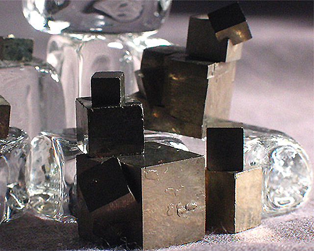
I like the contrasts here, both of the materials and the pointed vs rounded right angles. The lighting and depth of field emphasize the three dimensionality of the subject, although as a viewer, I wish all the metal cubes were in better focus. The cubes embedded at an angle add interest, as do the imperfections in the surfaces. The cloth surface the cubes are sitting on doesn't really match the rest of the photo; a flat surface may have worked better.
Picture has a lot of noise. Lighting may be too strong. Bring the ISO setting a bit lower. Decreasing the Exposure level should also help. These two things will give the pictures better contrast. Shadows and reflections would look a lot nicer.
the lighting nees something i think. the glass and the cloth need more, or the blocks need less. hard one to light. I really like the blocks...maybe would have left the glass out. good effort either way..





 Add photograph to your favorites
 Add photographer to your favorites


 Photographer found comment helpful.


