I've been wanting to do a reshoot of this idea for a while and this challenge seemed the perfect opportunity. The original can be seen at
//www.photo.net/photodb/photo?photo_id=3040201
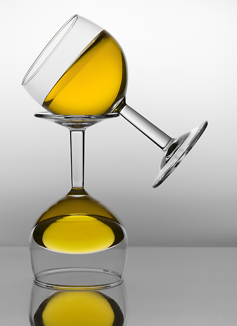
I had two disaster's shooting this. One glass shattered while testing the setup and the other while shooting. Jello and glass everwhere. While not the same as the original, due to lack of glasses, I still liked the way it turned out.
All editing in ps cs and neat image
Raw Conversion - shadows, brightness, temperature
crop
rotate canvas
levels
curves
brightness/contrast - br=-4 con=+10
hue/saturation - red= -100 sat
yellow= +2 hue
green= -100 sat
cyan= -100 sat
blue= _100 sat
magenta= -100 sat
healing brush - dust(sensor & base), light reflections,
smooth jello, various minor imperfections
convert to 8 bit
save tiff
neat image
resize for web
unsharpmask
Statistics
Place: 7 out of 404 Avg (all users): 6.7213 Avg (commenters): 8.2500 Avg (participants): 6.6541 Avg (non-participants): 6.9000 Views since voting: 3687 Views during voting: 364 Votes: 183 Comments: 26 Favorites: 10 (view)
I actually like this version better I think David, seems to fit the minimalist feel. I figured out that this was Jell-O, it's a wonderful idea, and well executed. I'd love to know how you got that perfect gradient onto your background.
There is a WOW factor!! Very nice, clean. I always wonder how you guys do it without any light reflection. Would like to see the explaination later. Should be in top 5.
Interesting. I take it you glued the bottom glass to a side wall so that the top glass is actually pointing up and thus not spilling? Whatever you did pretty cool.
The title states the true composition of the photograph!! "Balanced"
Very soothing and a delight to look at!! Its yellow, and different. Well thought out!!
Composition is simple and clean in presentation. The yellow hues in these two balancing act glasses really captures the eye's attention. Not to mention it makes the viewer do a double take and take a good long look at the liquids that seem to be defying gravitation. Lighting to illuminate the subject is very good. The only critique I have for this is that the reflection of the bottom glass on the surface is destracting and detracting attention away from the main focus which is your subject of the two balancing glasses. Either a close crop to the lip of the bottom one would eliminate that reflection or a less reflective surface that does not reflect the object's image back would greatly improve the overall composition ot this piece.
Huh..
Um.. I don't think they're s'posed to stack like that. I can't stop looking at it, trying to figure it out. That's really interesting... k, I'll give it a 10 cause all the technical stuff is perfect, and cause it pretty much absorbed every bit of my attention for several minutes. :) ..and I'm still confused. :)





 Add photograph to your favorites
 Add photographer to your favorites

 Photographer found comment helpful.


