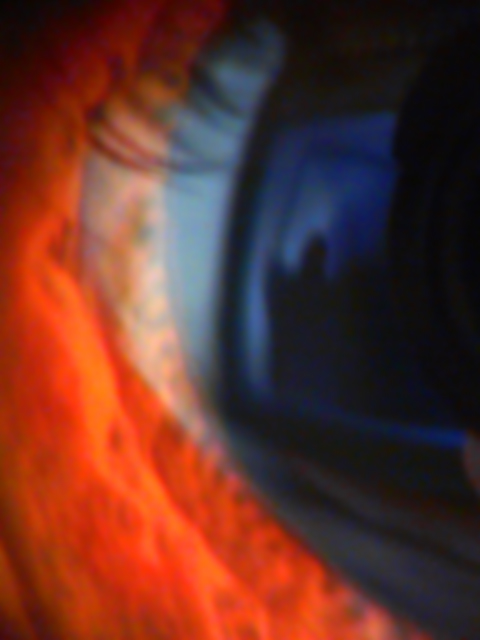
So this is what I get for submitting a not-so-obvious pic lol. I figured that some people wouldn't get it, but I didn't think it would be this bad. Yes, I know it is blurry.
OK, so it's a picture of the Grim Reaper reflected in my eye.
It was so tight because:
1. I didn't want the eye to be so obvious.
2. I didn't want the reaper to be too small.
3. I was trying out a new technique.
4. I didn't want this to be just another picture of an eye that happened to have a reflection in it.
I agree that it could be sharper, but because of the nature of the fear I wanted to keep it blurry. In my mind death is not a black and white thing that appears crystal clear and tack sharp. I know this is difficult to convey just with a picture.
The title is loosely based on a scene in "The Seventh Seal" where the knight is playing chess with Death. If I titled it "Grim Reaper in the Shadows" or something I'm sure more people would have understood it... oh well...
So finally, I realize there are a few things I could have done better, but in general the result I got was the one I wanted.
this image would have been better if you saw more of the eye ... it took me a few times to actually figure it out ... i think it's cropped too tight .. and too close
I can't figure out what this is therefor have a hard time voting here. meeting challenge = 2 Photo quality = 3. I wish there was more here for me to go with. total = 5
sorry, too close up and blurry for me. i think there's a reflection in the iris that's important to the photo, but very hard to make out. -- gr8photos (2)
it looks like the eye of a wild animal targetting his vicitm (looks like you ;-) nice idea! unfortunately its very blurred and it does not look good on the photo. nice colors but a bit dark.
It wasn't until I walked away from the computer with your image on full size that I really got it. Somehow, sitting at the keyboard, it seems mostly blurry to me. The colors are astonishing. And now that I can see the reaper in the eye, it has more meaning. Perhaps you've gotten too tight and the reflection is too subtle for a high ranking.
Very interesting treatment of this fear. It might have been a little more effective if the color of the skin on the lower lid was more normal. As it is it's a good almost abstract design, but it doesn't tell your story with enough power.
Nice colors for establishing some contrast and setting the mood. I understand the artistic blur, but feel that it is a bit overdone to the point that it is difficult to find the subject in the background. Having said that, I like the photo causes the eye to flip between the foreground and background.






 Add photograph to your favorites
 Add photographer to your favorites


 Photographer found comment helpful.


