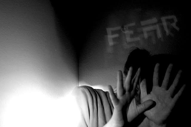
I think the words fear were not needed in this shot. The expression is there. The only thing that I dont like about this shot is the lower left is way to bright.
At first I thoughtit would be stronger with about half of the "extra" space on the left cropped-off, but I'd reconsider that if your intent is to create a "flowing to the left" effect...
Very good, especially the dramatic lighting. Although it's not really bothering me, I think the text isn't necessary because the photo shows fear even without it. It is a nice effect though.
Love the text and the semblance of action, but the negative space kinds of bothers me. Would like to see it cropped differently (perhaps this photo lends itself to a more vertical slant) or I'd like to see it with the text in the upper left hand corner. Still, it's a real nice shot.
I like this, but I'm not sure about the overexposed lower corner. Was this intentional? It sort of has the effect of being a supernatural entity or something like that, but if that's the case, the connection is still a little weak. Otherwise, nice black and white
Artsy shot. After the challenge, I would be interesting in how you "blew out" the head and neck. Interesting effect, good suspense. Might be overly deep for this site. 7 Swash
I like the bright base balanced by the dark at top. I especially like the use of the corner. The obscure individual with hands raised is nicely detailed. Why'd you feel a need to label it over the person's head?





 Add photograph to your favorites
 Add photographer to your favorites


