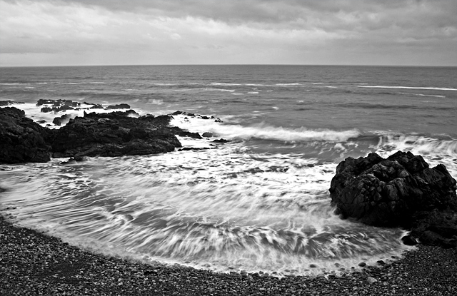
The first thing I noticed was the shape and pattern in the nearest tide ebb. It appears to have movement and that helps give the image a little more energy and interest. The black and white conversion looks a little dull and flat on my monitor. I almost feel like you could have recropped it to not include the horizon/sky in order to put more emphasis on the contrast between wave and beach as that is where all the interest is within the image.
Like the shot, the detail of the foam in the wave looks good. Might've like to see it in color but it looks like it might've turned out dull looking if it was cloudy. - 7





 Add photograph to your favorites
 Add photographer to your favorites


 Photographer found comment helpful.


