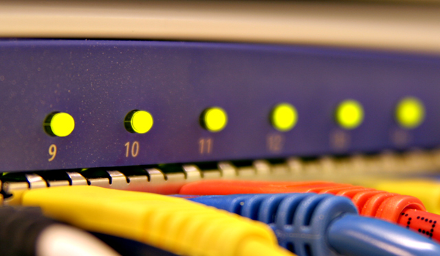
This is a NetVanta 1224R (one of the products the company I work for makes). It is a switch/router which allows several computers to connect to the Internet at the same time.
Cropped
USM
Auto Levels
Save for Web
The silver specks on the blue faceplate are actually part of the design of this unit. I'm sure people will think it is dust but it is not.
Statistics
Place: 315 out of 422 Avg (all users): 4.6406 Avg (commenters): 8.0000 Avg (participants): 4.5514 Avg (non-participants): 4.7529 Views since voting: 1000 Views during voting: 257 Votes: 192 Comments: 7 Favorites: 0
I suspect that subject matter may have contributed to the score. Not sure that people would generally consider this abstract and therefore marked down accordingly. However, the actual image is quite good. I agree with Bear on the DOF issues here in this one, as opposed to the last one that I just commented on. Colours are good.
I think the object is too obscure as to what it is and what it does. I know what it is, but someone that doesn't work around them probably wouldn't have a clue. And not understanding what the object is makes it hard to appreciate the picture.
It's already been mentioned about DOF, but something addition to what has been said is front focus. While it's not unusal to have the object fade from in focus to out of focus, having the front out of focus is kind of like hitting a visual brick wall. It just stops the eyes for a moment since the first thing they see is that out of focus area. And I think that in shallow area like you have here, you should have more area in focus and less out of focus.
The colors are well done, exposure is well done. And yes, I would have thought the specs were dirt or something. :D
Again, I see DOF issues here. What's intriguing, and even instructive, is that the LEFTmost lamp is sharp and the RIGHTmost cord of the 3 is sharp. This is kind of frustrating visually. The reason it is happening is because the camera is aimed at an angle to the subject, and the plane perpindicular to the lens at that given focusing distance includes both those points.
FYI, in case you did not know it, at any given f/stopo and any given focusing distance you have "x" amount of DOF and it is distributed as follows: 1/3 of x in front of the point-of-focus and 2/3 of x behind the point of focus. In other words, if you have 3 inches of DOF to work with, and you focus at 4 inches, the DOF will run from 3 to 6 inches.
It can be helpful to actually MEASURE the actual physical depth of your subject in a shot like this, and then place an extraneous object 1/3 of the way into that depth, and manually focus on that object, then remove it and make your shots at several different apertures, to choose the one with the most pleasing DOF for your composition.
I dunno about the image for the challenge (it doesn't seem so abstract to me), but I love the shallow DOF and the angled colors make the image interesting.
Nice tight color. The writing on one cord is somewhat distracting. The uniform lights are competing. Maybe the cords should have been in focus too.
I love this photographer.






 Add photograph to your favorites
 Add photographer to your favorites

 Photographer found comment helpful.


