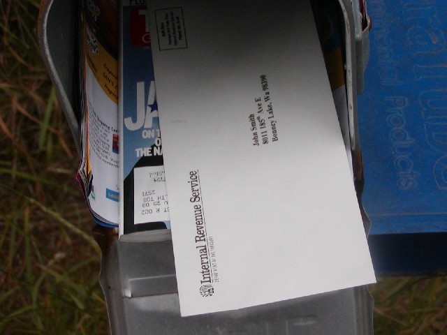
Good composition and focus. I don't know if it would make it better or not, but maybe an angle slightly sideways to the mailbox, so that the mailbox fills up the frame that the letter doesn't. With the paper box on the right, it seems somewhat unbalanced. karmat
I thought about doing something like this (your title was my subtitle), but went with another idea instead. I think your photo quality is better; I still kinda like my layout (it's posted as an outtake in one of the forums) -- I did that before I saw this one...
Brrrr, that's scary! I like the magazine under the letter. The two letters showing could be the start of 'Jail'. Good job technically, unlike 90% of the entries this week, yours actually has adaquate DOF. Shey.
shudder, IRS.....Well, John, focus is good, composition/framing O.K. Nit time: What is the blue mat to the right and why is it in the frame? Try using a fake address, too, like florida, if you are going to "not let us know who you are", Tom. 8 Swash (you should have done the shotgun wedding shot!)







 Add photograph to your favorites
 Add photographer to your favorites


