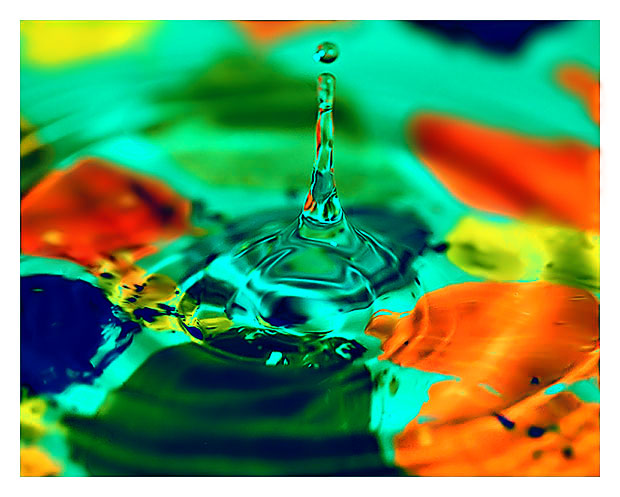
A bad attempt to copy Rackats "A Splash of Color". The paint I used on the bowl that held the water was water based and dissolved fast as I was doing the shot.
DOF should have been much better among other things but it was almost midnight on a Thursday night so I just had to submit it as is.
Statistics
Place: 103 out of 141 Avg (all users): 5.6800 Avg (commenters): 6.2500 Avg (participants): 5.3690 Avg (non-participants): 5.9052 Views since voting: 936 Views during voting: 308 Votes: 200 Comments: 12 Favorites: 0
First of all, I don't think you should put the word "bad" in your title. It makes the viewer think there is something wrong with the photo, look for flaws and perhaps vote you down. That being said, it's a good photo. The top of the water drop is not quite in focus. The colours are great.
Not bad really but the top of the drop would have to be as pristine as the lower part for me to really dig this shot. It just needs better clarity but like I said, not bad at all.
I wouldn't be apologetic in the title...that guarentees people will agree with you and mark you down...you should have been confident and called it an improvement! It's a good shot 6







 Add photograph to your favorites
 Add photographer to your favorites


 Photographer found comment helpful.


