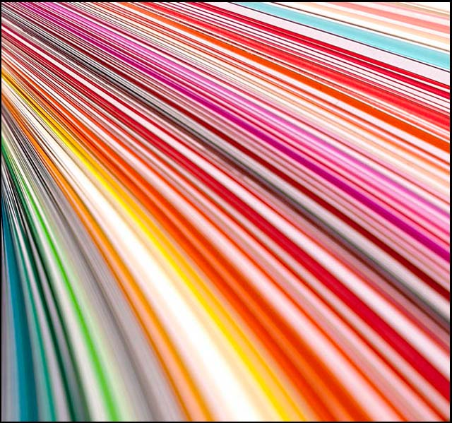
This might sound weird, but I think if the image was rotated 90 so the in focus portion was at the lower left hand coner and the lines exploded up and to the right (instead of down and to the right), it would give more life to the image. Well, that speculation aside, I like the image but it could use some noise reduction. (or maybe it's the jpg quality?)
The colors are exciting and the fan angle is interesting. But I can't help thinking that this image would be stronger with the focus in the foreground and the blur somewhere further back.
Like another entry in this comp, using the same subject matter, it is well composed, however I would have liked to see it more in focus at least down to the bottom 1/4 and an uping in hue saturation. None the less it does it for me, and I am a hard marker :)
Flawless compositon of the lines, the only thing that bugs me, and it's slight, is the cyan stripe near the top right is larger than the rest of them. But, like I said, it is very minor. Well done.





 Add photograph to your favorites
 Add photographer to your favorites


 Photographer found comment helpful.


