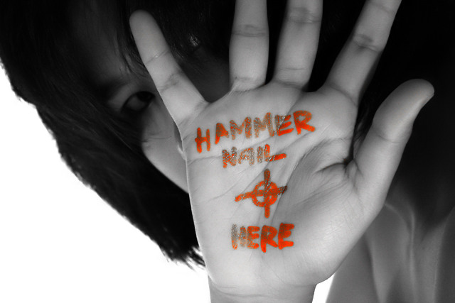
The content of this picture is actually very intriguing to me, even though I am a devout Catholic. I do not find it in bad taste, although I do not like the florescent orange of the writing, and thought that the photo must have been spot-edited, so I only gave it a 4.
I didn't get this far thru the "Hands" voting...shame...because I get it and think this is very well done. And I do believe in God.
(Actually, word is that now they think Jesus was probably crucified thru the wrists, as his hands wouldn't have held his weight upon the cross.)
You are taking risks when you take a shot like this, but I don't find it in bad taste...the title explains it. I don't like when people use Bible shots just to get the higher score, either. I feel guilty when I vote low on a Bible image, no matter how poorly focused or badly lit. ;) This has none of those problems.
okay, as i have started a thread on teh forum i.e. this entry, i think it would be proper to cap things here.
thank you for the constructive positive comments and thank you for the constructive negative comments.
to people who comment, keep on commenting. comments help newbie photographers like me better ourselves at our craft provided that your comments were well-thought of and not impulsive, like most of my comments here.
thanks guys. i'll definitely do better next time.
I've tried similar and like you I got hammered (pardon the pun).
Anytime you delve into sexuality, religion or politics in your art, you are going to get a wide range of emotions from people (in our case voters).
The way I have come to see it, is that when you try these images, if you don't get reactions on BOTH ends of the scale, you haven't done something right. Because, when you REALLY have some sort of message, people are going to love it or hate it.
If you want a lot of high votes, shoot something pretty. If you want to make some sort of statement, be prepared for negative remarks.
I sincerely believe the BEST art isn't pretty. Keep doing what you are doing, man. But, just start taking the negative comments as compliments :-)
Nice idea, strong and emotive. Writing looks more orange than red to me, and faded out. More sharpness on hand and clean red lettering would be better, and maybe consider adding a blood drop or two below the target.
I like this picture. Though I wonder if those who would crucify need instructions. Call me a pessimist but I think the evil is easy. It is the good that is difficult to do.
hahaha! what a great idea hee hee. i doubt it'll do well here, but it's a good photo. it'd be nice if maybe the pose allowed for a straighter view of the hand and a greater view of the face. i'm not the biggest fan of selectic desat, but it works fine. i think an all around gritty b/w would've made the shot even more emotive. but that's all beside the point! this is cool!





 Add photograph to your favorites
 Add photographer to your favorites

 Photographer found comment helpful.


