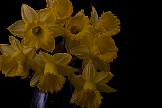
It reminds me of something from an old book. Normally we want to see daffodils pop with brightness but I like this. Personally, I wish I could see a little more of the vase. The lines are so flowing that my eye keeps trying to follow and isn't allowed to go far. But then we'd lose detail in the flowers if you pulled back, and I like that too. Okay, I guess that means it's good, if I want to see more, right?
The colours of the petals seem a little muted, which doesn't really strike me as low key. I'd have gone for a simpler shot, maybe just one flower on the black background. Good detail in the petals though.
Not sure this was the right subject for this challenge. To me dimming the exposure enough to make the flowers look low-key mearly made them look muddy and undersposed. Sorry.







 Add photograph to your favorites
 Add photographer to your favorites


 Photographer found comment helpful.


