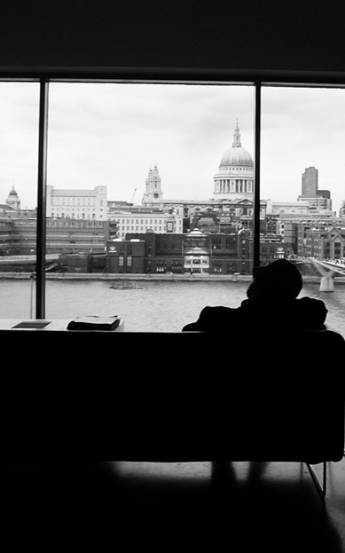
I like a lot of this composition, but it would be improved by removing the two vertical lines in the windows. The sky is also way blown-out in my opinion.
I really like the silhouette here but I feel trapped. Maybe a slim black border would help make this image seem more finished (I usually hate borders). I also find the slight tilt to the right capturing my attention as the image has strong horizontal lines. Fixing that might fix my trapped feeling. The image is perfectly exposed for the subject and works very well in B&W. 7 - good luck in the challenge!





 Add photograph to your favorites
 Add photographer to your favorites


