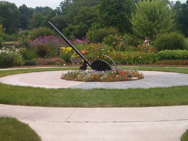
this whole photo seems a bit washed out. the composition has the sundial centred, which *could* be okay, but the rest of the strong features are not quite centred, which throws the whole thing off imo.
The image is a little muddy looking, I'm guessing from a high compression. I think a different angle might be better also. The subject is right in the middle of the frame, and isn't altogether that interesting.
I like the composition of the photo. I wish the person was not in the background. Also if you could have backed up a foot or two so that the entire cement circle were in, or to have incorporated the cement circles more - I think that would have helped the picture. The color is lovely.







 Add photograph to your favorites
 Add photographer to your favorites


