Hi! Here’s a comment from the Critique Club.
First Impression:
Looks interesting! I recognize the déjà vu!
Composition:
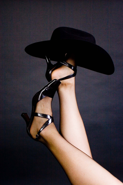
Good location for the hat, legs provide nice leading lines. Background nice contrast for the legs. I like the colour and the colour fade of the background. Left foot looks a little stiff. I don’t wear high heals, so I don’t know if you could have pointed the left toe a little more.
Subject:
Nice adaptation on the original. Meets challenge.
Technical:
Unfortunately you didn’t provide any post processing information, so I’m not sure what you were trying to achieve. I find the picture grainy. A second light, or bounced light could have given more detail to the Hat. The hat & foot create a “black hole.” The legs almost appear to be over exposed. Some dodging and burning may have helped tone down the legs and bring out more detail in the hat.
Summary:
I liked the concept, but this was a really tough challenge. The pictures needed to really pop technically to do well. It’s frustrating when a decent scoring picture places so low.
|





 Add photograph to your favorites
 Add photographer to your favorites

 Photographer found comment helpful.


