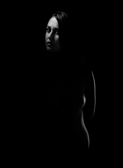
I like the curves (a lot) but would have lit the face a bit less, shadows are too strong there and conflict with the suggestive shadows of the body. Just my 2 cents.. :)
I wish there were more detail in the shadows. Her head seems disconnected from her body here. If there is any detail in the lines of her neck, I can't see it on my monitor, and I have been doing well viewing so far in this challenge. I like the lighting on her face and, considered seperately, the lighting along her side. Her forehead is the biggest/brightest thing in the composition, and it draw attention up and out of the frame (although I realize in basic editing burning that down is not an option). I love the lines of her arm, hip, breast. The two subjects - her face and her curves - seem to compete with each other here. As if they really belong in two seperate images.
Interesting effect. The way you have lit the head from one source and the body from the other source gives a bit of lop-sided, nearly disembodied look.





 Add photograph to your favorites
 Add photographer to your favorites


