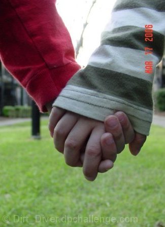
Challenge:Hands (Basic Editing III) Camera:Sony DSC-S75 Location: In the yard behind my apartment. Date: Mar 17, 2006 Aperture: 2.5 ISO: 100 Shutter: 1/80 Galleries:Family, Emotive Date Uploaded: Mar 21, 2006
I took this picture when my oldest son fell off his bike and his little brother was helping him up. I caught
the picture just as they were walking back to their bikes and what a better time to get the shot. I left the date in the picture because I didn't want to Photoshop the image and I didn't want to crop it out. I tried it but the picture was so far off that it didn't look right.
Statistics
Place: 266 out of 287 Avg (all users): 3.7463 Avg (commenters): 3.5455 Avg (participants): 3.4533 Avg (non-participants): 3.9154 Views since voting: 866 Views during voting: 273 Votes: 205 Comments: 12 Favorites: 0
I nice idea, but a bad picture. The time-stamp is almost never a good idea; the colors are horribly weak; the image isn't exactly "sharp"; really, it just looks as though you snapped this off with a camera-phone. Sorry if this is harsh, but I don't have much else to say, here.
You realy need to turn the date off. Cute idea, and the leading lines of the grass and the paths work well to pull the eye into the hands, though the lamp pole does not.
I love the framing and the composition and the red green and neutral colour arrangement. What bothers me is the hot spot seen from in between the hands. There's almost nothing except white there. Also a little more DoF could have helped.
i like the almost heart shape this has formed. some suggestions that i'm sure you're going to get barraged with, but i'll say them anyway:
1) ah! gotta get rid of that date stamp. "March 17 2006" is intruding upon your composition!
2) for most purposes on this website bigger is better. the size on this was perhaps a bit too conservative.
3) ignoring the date stamp, the weakest element of the photo, I think, is the background. your subject is obviously the hands holding one another, so a background with minimized contrast/busyness would be best. in the case of this photo you have the grass (which isn't a horrible background) giving way to a very bright sky. the result is that the sky looks washed out and "glows" while the subject becomes dim and loses contrast. this is a good idea for a photo, but definitely a more solid, consistent background would be a good idea, because it'll bring out the subject better.







 Add photograph to your favorites
 Add photographer to your favorites


 Photographer found comment helpful.


