Hi Anil...and how interesting!...my nephew who is to be born in a few short weeks will have the same name as yours...Anil Kumar! A small world isn't it?
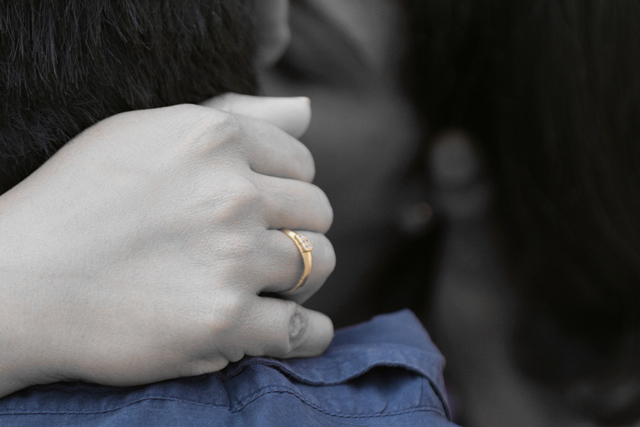
I am a huge fan of the very short DOF...as I mentioned in my comment made during the challenge, this is an image one needs to take their time with when looking at...enough time to allow the image to draw us, the viewer in and "see" the couple...for me, the focus on the knuckle empahsizes the physical embrace, the grip...and the image is all about the embrace, the moment...about two people sinking into one and other...it's all about passion, but in a more cerebral level and not an "obvious" way which would have been more DPC friendly IMO. The toned down coloring was nice...full on color would have been distracting...maybe try another verion and give B & W processing to see how the image evolves? I enjoyed the subtle "intimacy" of this image very much...hope I was able the shed some light on your placement....really 85 out of 281 isn't all that bad in my book...it's a fine image.
I agree about the DOF...it's actually too shallow. Hard to tell what's going on in the background. Had you not posted in a thread, I wouldn't have known. Even if you stood to the right a bit more, there may be more detail in the faces where the hand is blocking any kissing action as it is.
I'm also not crazy about the selective color. That pulls your eye to the foreground even more, which is what you don't want since the focus is supposed to be on the "amour". Also, how does the fact that someone has a blue shirt add to the image? I didn't vote in this challenge, but thought I'd add an IMO per your thread request. Very creative idea!
I like your creativity with this. The only problem I have with it is the DOF - it's too shallow . I would at least like to see the front hand in focus...or at least the fingers. My eye gets drawn to the OOF ring.







 Add photograph to your favorites
 Add photographer to your favorites


 Photographer found comment helpful.


