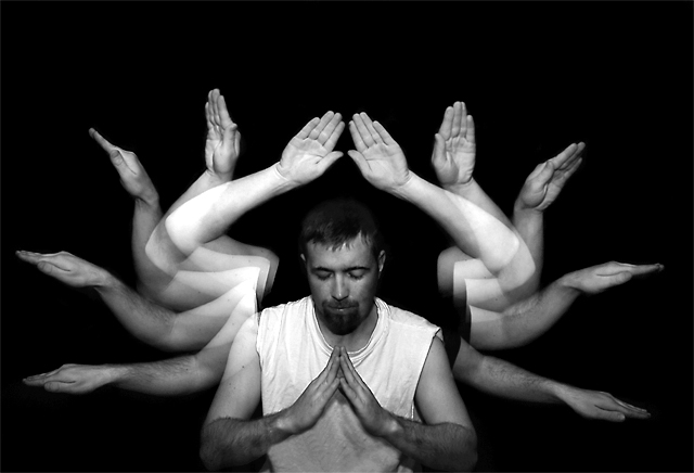
This idea came from graphic funk, I always thought this photo was cool. This was the first time I ever tried multiple exposures. I geuss its not too bad, but graphicfunks photo was hard to replicate.
Statistics
Place: 55 out of 141 Avg (all users): 6.2806 Avg (commenters): 6.8889 Avg (participants): 6.1294 Avg (non-participants): 6.3964 Views since voting: 1446 Views during voting: 380 Votes: 196 Comments: 11 Favorites: 1 (view)
Hmmm, not sure what kind of critique I can give you on this shot. To me, it is actually a great tribute shot of the totally awesome original by graphicfunk. I think you did a very nice job on the shot. Far better than I could of done :-) , and probably far better than most folks could of done. It is most definitely very readily and quickly recognised as a tribute to 'Wading into Eternity'. The clarity of your hands and arms is great. The exposures look pretty good. Maybe just a touch hot on the top set of arms, but just minorly so. I think the image works well in b/w. I agree with the comment that Dan's original has the edge on lighting, and a slightly stronger composition. I think if you could of got a little better positioning of the arms, in relation to the body, it quite possibly could of bumped your score up. Still, 6.28 is not bad at all. A very fine tribute and great entry for this challenge. I agree with graphicfunk, this show's a great grasp of technique, come up with some concepts and show us what ya got! :-)
Sorry I couldn't muster up a better critique for you. If you have any questions or comments or anything, please feel free to contact me.
His shot was just composed and lit better, you just barely cut off the elbows and then leave so much space up above but this is pretty good, got a 6 from me.







 Add photograph to your favorites
 Add photographer to your favorites


