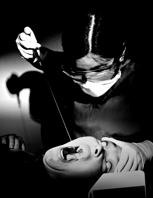
The girls at work had a lot of fun posing for this one! I turned off the clinic lights and used three different overhead chair lights to create the lighting effects. The exagerated needle was fashioned from a long piece of wire...we dont REALLY use those...hehehe.
I was hoping for the old hollywood horror flick look on this. Hence the grain and contrast.
Statistics
Place: 3 out of 60 Avg (all users): 7.0696 Avg (commenters): 8.4000 Avg (participants): 7.3469 Avg (non-participants): 6.9450 Views since voting: 9561 Votes: 158 Comments: 47 Favorites: 17 (view)
congrats on another ribbon, julia! for some reason, i had a feeling this was yours. i love it! looks like a fun shoot and the pic turned out great. well done!
you are killin' it, girl! congrats on another ribbon--fantastic shot. the lighting, setting, expression--all perfect. i really like the shadow in the back. awesome work.
The girls at work will be thrilled! They asked me non stop how the darn thing was scoring...cant wait to tell them it won a ribbon. Thanks for the comments...we had a lot of fun with this. That irritating white thing in the lower corner is actually supposed to be scary. Its a papoose restraint thing. Oh well...didnt photograph too well. The patients face was just too perfect in this shot...so had to go with it.
Haven’t seen the film (not sure I want to :-), but in my humble opinion your photo is great, I love the models poses and the shadow of the arm/needle on the wall. My only slight criticisms are; the glove and mask look a tad over exposed. Also the object, in the bottom right of the frame slightly obscuring the victims face, looks a little out of place. Apart from that it is a cracking photo. Good luck... Tom.
No doubt that you will be in the top 5 finishers and maybe even take 1st place.
You have done well. I have you tied with one other photo for my top score. Good luck and enjoy your ribbon.
Outstanding picture!!! I've honestly never seen the movie but this looks like it can be a poster for the movie and be an isntant classic. The lighting on the patients face is perfect while the shadow on the wall finishes the picture off nicely. Well done. - 10
1. Did you capture a scene from the movie (as the challenge brief states) or did you enter a picture and fit a title to it.
2. How close a rendition is your image to the movie.
3. How does the image stand up in its own right.
In this case:
1. Unless you're some sort of wierdo, or a dentist, I guess you set this shot up for the challenge.
2. Scares the wotsit out of me just looking at it, very dark, very moody, very well done.
3. The lighting and exposure is very good, the shadow on the wall really adds to the menace.
Overall a very good picture which meets the challenge. 10
That is a great shot! Don't know the movie, but this one really looks good. I especially like the shadow behind the dentist and the great look in the patients eyes, would like to see this one win. 10 (and I don't give many 10's)
WOW, it hurts just to look at! I don't remember this movie, but I'll take your word on it. The only thing that keeps me from giving this a 10 is the exposure. I would have liked it a little softer.
Don't know a film called the Dentist but there's that horrible dentist scene in Marathon Man.. Ouch! I'll give you the benefit as it's a great image and I want to believe! 8
This shot is sooo freaky! I'm not familiar with the movie, but I'm sure it exists. If it doesn't, it should; I hate the dentist. That's one big friggin needle. The models are perfecty believable. The rolling eyes and wide open screaming mouth really fit the scene and the shadows are, um, well perfect. I hope this gets a ribbon. 10
Absolutely superb! My favourite this challenge. The victim's expression is amazing... I didn't know a mouth could open that wide! Excellently executed, the lighting is spot on. The graininess works well. Great composition. 10





 The Dentist
 Add photograph to your favorites
 Add photographer to your favorites


 Photographer found comment helpful.


