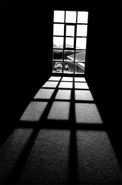
Well.. most people will be using this challenge to go overboard on teknical work so i have no change at all here. But you guys have to admit that this is a beautiful shot even tho i know i coulde have done it better and ofcours it sufferst from the lack of cam quality and so on.. I like it and i hope to get a % over 30 on this one :)
IF YOU ARE READING THIS TELL ME WHAT YOU THINK!!
Statistics
Place: 50 out of 281 Avg (all users): 5.8868 Avg (commenters): 6.6667 Avg (participants): 5.6044 Avg (non-participants): 6.0992 Views since voting: 1768 Views during voting: 319 Votes: 212 Comments: 27 Favorites: 2 (view)
what drew me to this photo was the texture in the foreground, and the way the squares of light keep getting lighter as they get to the window. Great composition here. Excellent work!
Nice use of leading lines...the shadow on the floor leads you to the window. I like the fact that it is not exactly level, I think the slight tilt adds to the photo rather than detracts from it.
Read your comments and i pretty much agree. Although, I think if you CAN make the image appear better, you should. It's like anything else... do it to the best of your ability eh?
I really like this photo, especially the shadow play from the window. The only things I can see that might improve it is maybe leveling the window and making the parking lot in the background bokeh.
Very nice shot here. You nailed the exposure and that's not always an easy thing to do with such a contrast of lighting. The detail outside of the window would have been washed out for many folks. I also like the slight slant in the angle of the overall shot. Great work and one of my favorites in your portfolio.
I rated this one pretty highly in the challenge - definitely one of the better shots. I liked the angle, I liked the shadow/leading lines. Very well composed and exposed.
A lovely low-key image. I think the balance of highlight to dark is excellent, and the soft highlight and shadow of the window pane on the floor disappearing toward the user is very satisfying. The thicker, central pane is a perfect catch for the eye, from which one wants to look all over the image. I might have preferred the scene out the window to be slightly in bokeh. A great image.
hey actually I like this one a lot! it doesn't matter what kind of camera you have actually, it's the photographer that makes the photo. and you did!
I like it, really do. even the tilted frame looks like it was planned and really fits the photo. black & white fits great too and the contrast is perfect. I think you did a great job!
you just left a comment on one of my pictures, so I thought I'd return the favor......
i like the picture a lot.
the black and white is perfect.
even the angled window is spot on.
it's a shame that you couldn't have gotten just the mountains in the background and not those line of cars.
that would have made the picture near on perfect.
I like this image a lot, I am definitely a beginner at "low key", don't know if the bright sky belongs, but this is fantastic. The composition and DOF are wonderful and of course B&W is essential. Good luck.
What a fabulous composition. I really like this picture a lot. This is clearly one of the top images in the challenge. It fits the more common definition of low-key which references image tonality in the shadows and lack thereof in the highlights moreso than the challenge description. Some voters here will probably think it is to "bright" and it will get some low votes because of it. Sure hope not. Great job!





 Add photograph to your favorites
 Add photographer to your favorites

 Photographer found comment helpful.


