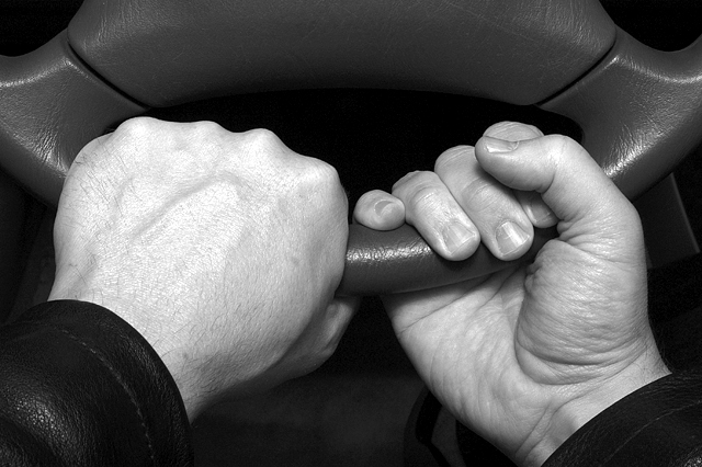
It seems to me that pictures of hands for this challenge needed to be inherently interesting and had to tell a story. I think because most people don't hold a steering wheel this way, it was hard to conceive what message you were conveying. I don't get driving out of it. It might have been more interesting with just the right hand, which has lots of interesting detail, not apparent on the left hand.
You didn't make any major mistakes with this image (focus, lack of tonal range, bad cropping) I think it just lacks any "pop." The hands are sharp and in focus. They show good detail and aren't blown out. That's all good. But they're posed in a strange way. It's a little confusing. It's unclear what you're trying to say with the image. I'm sure many voters said, "it's just hands holding a steering wheel in an awkward way."
So all this is in response to you asking why the image did not fare so well. Again you didn't make any major mistakes with the photograph, it's just a perplexing pose with slightly bland subject matter.
I'm not sure too many folks grasp the wheel this way but you do demonstrate some good hand textures by featuring both sides of the hands. Nice tonal quality and sharpness.






 Add photograph to your favorites
 Add photographer to your favorites

 Photographer found comment helpful.


