Interesting concept for the challenge... However, I feel your execution missed on a couple of points...
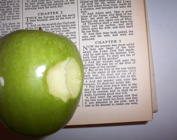
The table to the right and below the Bible adds nothing... Crop it out :)
If you could have found a better light source that would give an even illumination it would have been a big help too... To see what I mean, look at Chapter 2, Verse 23 and compare the readability to Chapter 3, Verse 3... The light on 3:3 is much harsher and makes it more difficult to see... To be "a light unto the world", you will need to master lighting a little better :)
The focus on parts of the apple are off... I feel this could have been a MUCH better shot if it had been much closer in and only had the bitten part of the apple...
Last, but certainly not least, the Bible should (in my opinion) be straight... It is severely slanted here...
Great concept though... Nice interpretation of the challenge.
I knew I'd see this sometime! Lighting could be better - the flash is a real pain in the apple. Viewpoint is a bit dull, perhaps improved by coming lower down closer to the page and using less of the apple (macro?). [4]
I think this is a fantastic idea. I woul have set the pages on some foliage to give the effect of actually being there. Again, it was a really good idea with a lot of potential.





 Add photograph to your favorites
 Add photographer to your favorites


 Photographer found comment helpful.


