Comment from a member of your own commenting club :-)
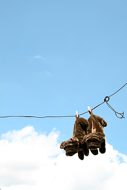
Nice idea to hang your shoes up like this.
What is good in this picture?:
1. Focus is ok
2. Nice colours
What could be better?:
1. Looks as there is a bit to much contrast
2. The "faces" are a bit dark so at first sight you don't see what it is you are looking at.
3. The clouds are a bit blown up, to white. So I can see the trouble you are in, shoes to dark and clouds to bright and you have to apply the same to everything in the picture. In some editing programs you can apply brightness differenely to midtones and other without violating "Basic editing" rules.
Hope this helps something.
thanks for the comments, guys.
i wasn't really expecting much as it was my first challenge. i'm glad it didn't suck as much for some people and actually enjoyed it.






 Add photograph to your favorites
 Add photographer to your favorites

 Photographer found comment helpful.


