You are able to have the largest side of your photo measure 640 pixels. You should try to take advantage of that in the furure. A photo this small will never win.
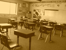
very clean, agood subject matter... Although, the walls in the back have stuff on them... if that were gone, the title might fit more... but then it might not look as good.. I don't know
bummer this is soo small - you've probably gots tons of comments on that already and probably already know that your largest side can be a 640 max. having said that - it appears to be a pretty good image that meets the challenge a bit better than some others I have seen - so good job on that - can't really make out the quality of the image at this size but the sepia choice looks interesting, seems like there is a slight slant for effect - and I like the title :)
Sure wish this was a bit bigger. Anyway, seems just a touch overexposed (highlights blown out a bit) and needs a human element in my opinion like a student or teacher.
Just in case you don't know - you can have up to 640 x 640 pixel photographs in challenges and most people will mark you down if you don't enter a larger photo. (you may already be experiencing that). It's a great photo though with a nostalgic feel to it.
This is a great image. However it being so small its hard to tell the detail. I believe this would have done great if it were the standard size for this site.







 Add photograph to your favorites
 Add photographer to your favorites


