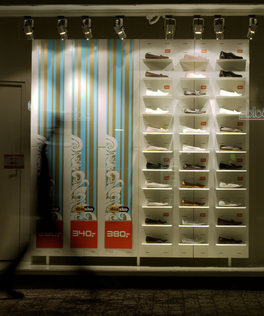
A really simple shot. The only hard part of making this image was the timing in order to make the walker blurry in the right part of the image. This was the sixth try. Too bad this wasn't advanced editing. I really would like to clone out the reflecting signs from the shop behind me.
Statistics
Place: 197 out of 271 Avg (all users): 4.5882 Avg (commenters): 6.1250 Avg (participants): 4.4124 Avg (non-participants): 4.7092 Views since voting: 815 Views during voting: 318 Votes: 238 Comments: 9 Favorites: 0
I really like this one, very artistic and something a bit different. The motion-blurred figure adds just the right amount of life to it and the composition works really well. 9
I don't quite understand the title. I like this because of the blurred figure, the warm quality of the light and the area of bright color in contrast to the overall neutral tones. This isn't the kind of thing that tends to do well in the voting, however. It appeals to me, though.
I like the lighting, but I think the composition would be stronger if you cropped a bit tighter around the showcase. Also, the text on the window and the walking figure are distracting





 Add photograph to your favorites
 Add photographer to your favorites


 Photographer found comment helpful.


