Author Thread Comments Made During the Challenge
Post actions
Post actions
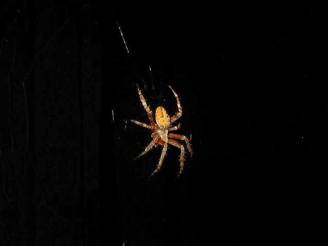
Love the drama created by the lighting. Maybe a little tighter crop and off center placement of the subject could possibly have made this even better.
Post actions
While this is definitely an interesting picture of a spider, it doesn't really feel "in the garden"y to me. I see some background detail that looks like it may be a fence or something similar, but it's hard to tell, as dark as it is.
Post actions
I think this would be nicer without so much negative space. Nice shot of the spider though.
Post actions
Post actions
Spiders are NOT my thing . . . ever! But it is a good photo.
Post actions
I had a picture once before and had a lot of black. They were right. And there is to much black in your to. Try cropping a lot more and just leave the spider.4
Post actions
Cool pic, wish more web was showing.
Post actions
what is that grey patch on the left of the spider? a reflection?
Post actions
great detail. I'd like him to be a bit off center though, because the black is such good negative space.
Post actions
This is, really, a wonderful photo, revealing only what is essential, and that beautifully, but...
Post actions
Post actions
Post actions
You shouldh ave cropped him. There is too much dark space which makes him less powerful.
Post actions
It's a great picture of a spider, but I don't feel the spirit of the theme "In The Garden".






 Add photograph to your favorites
 Add photographer to your favorites


