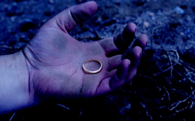
Nice take on the challenge. Appropriate mood in this pic with the contrast between the bright ring and the blue hand and BG. A touch of fill light on the RH side would have been nice to help separate the fingers from the BG.
this is nice. the contrast is good, the composition is good. The blue coloring works well here though i think it might be a tad too strong. maybe bring the saturation down a tiny bit, but that's also just my personal taste. I hope you do well, and good luck.






 Add photograph to your favorites
 Add photographer to your favorites

 Photographer found comment helpful.


