Author Thread Comments Made During the Challenge
Post actions
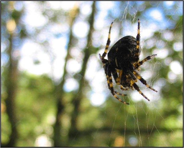
Eek! good focus, a tad more light would have brought this to life more. 6
Post actions
Very cool shot :) Nice detail on the spider and the web, with the background blurred out just enough, 9
Post actions
Post actions
Post actions
Too much white, hard on the eyes.
Post actions
I like the sparkles of light in the background and the vertical lines but they distract from your main subject. Less DOF would make the spider more prominent and your background less distracting.
Post actions
whoah, that's one fat spider! maybe a slight shift in angle would have moved the bright light from behind him. a little distracting. :o)
Post actions
Very good exposure for the spider and it's web. Good composition in an enhacng background. Congratulations.
Post actions
A bit more tonal separation from the background would be a great improvement





 Add photograph to your favorites
 Add photographer to your favorites


 Photographer found comment helpful.


