This is a great motion capture, very sweet and nice to see.
Here are a couple of suggestions that could make this photo better:
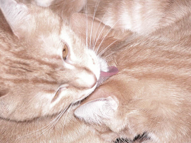
Better lighting. I'm guessing you used the flash for this, which is why you could have such a high shutter speed. Unfortunately, it washed out the color of the cats and makes them look overexposed. You can try and adjust the levels or contrast to help counteract this somewhat...
Spot Focus: The focus is best at the bottom of the frame, when it should be on the face or tongue of the top cat.
Framing: I know this was a fill-the-frame challenge, but I think the tight cropping here might have hurt you a bit. I say this because the two cats are so similiarly-colored that it's difficult to discern between the two.
a bit over exposed on the cat's face and ear of the second cat, but I love the mix of the two animals where they almost blend together, and that tongue is cute. :)
Composition: Nice use of ROTs. My eye was drawn to the black part at the bottom though - I would have tried to crop this out, if possible.
Technical: The focal point for me is the cat's eyes/nose, which aren't the most in focus. I think this would improve the image quite a lot. (I realise it's a pain to work with animals!)
Meets challenge: Yes
Overall impression: Nice idea, but lacking a little technically.
[ If this style of comment is useful, please leave a few yourself! www.calcaria.net/dpc.html ]
There is good focus on the one cat at the bottoms ear, then seems to get softer from there. the whites are a bit blownout. L like the overall color of them both filling the screen
Looks like my house. We have three orange cats. This is so typical. I like the little swirl in the upper right. I would say that the colors are a little muted.
Nice kitty...and composed nicely for the challenge. Brightness seems a little harsh to me, but both our cats are darker so I am sure this is the natural color. Focus appears to be a bit soft and would have been better if he(she) had cooperated and left both eyes wide open.
Pretty kitties! I like the composition of this photo. Adding a little more contrast or adjusting the levels would have helped make it a better picture.







 Add photograph to your favorites
 Add photographer to your favorites


 Photographer found comment helpful.


