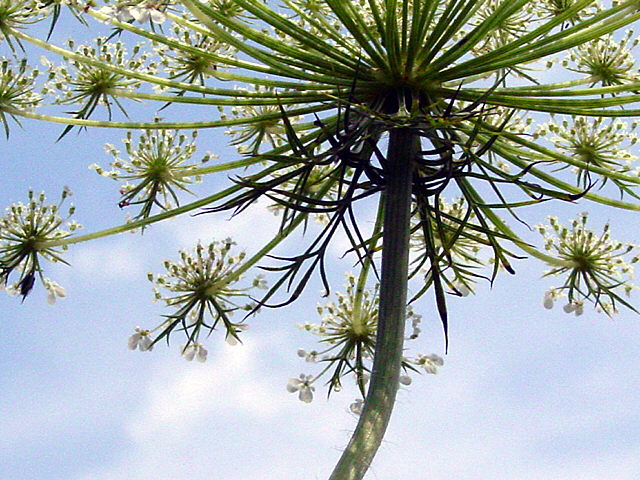
This is a lovely subject. I'd have liked to see a bit more of the tree-top, a bit less of the trunk - more a straight-up shot - especially as the bright light seems to wash out the bottom part of the trunk. Or maybe just a tighter crop, removing the lower part of the picture, if another angle wasn't workable.
I like this for its interesting perspective. I Can't hellp feeling it would benefit from haiving the flower head lower in the frame, though. There seems to be a lot of noise in the sky.
this is an interesting shot of Queen Anne's Lace! Composition is great, as is the lighting (use of available light).. could be a bit more in focus... nice job.
Although this is one of my favorite images in the entire contest this time, I have to rate it lower than I might otherwise like because, well, the subject *doesn't* fill the frame. :-/ I wish I could give this the 8 or 9 I want to (or the 10, if it weren't quite so grainy - higher jpg quality next time?), but I can't in good conscience, because of what the topic is.
I like that your shot is from the bottom up and i like your composition, though not really 'filled'
I also wish it was a little more focused. Mostly a good shot.






 Add photograph to your favorites
 Add photographer to your favorites


 Photographer found comment helpful.


