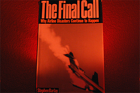
The educated passenger seems to always find themselves acutely aware that something is wrong. Problem is, seldom are they qualified to handle the controls of helpless Boeing 727 falling out of the sky in a rain made of fire and metal. Still wanna use those frequent flyer miles?
Nikon D50
2006/03/10 07:29:37.6
JPEG (8-bit) Fine
Image Size: Large (3008 x 2000)
Lens: 18-55mm F/3.5-5.6 G
Focal Length: 35mm
Exposure Mode: Manual
Metering Mode: Multi-Pattern
1/3 sec - F/9
Exposure Comp.: 0 EV
Sensitivity: ISO 1600
Optimize Image: Landscape
White Balance: Fluorescent
AF Mode: AF-A
Flash Sync Mode: Not Attached
Auto Flash Comp: 0 EV
Color Mode: Mode IIIa (sRGB)
Tone Comp.: Auto
Hue Adjustment: 0°
Saturation: Normal
Sharpening: Medium high
Statistics
Place: 160 out of 165 Avg (all users): 3.5549 Avg (commenters): 2.8889 Avg (participants): 3.4493 Avg (non-participants): 3.6195 Views since voting: 945 Views during voting: 282 Votes: 182 Comments: 10 Favorites: 0
I see this is just your second Challenge. Welcome to the land of DPC.
Your image is an interesting one, but I suspect its meaning was lost on our viewer/voters. It may be you were going for an edgy composition with the book in the exact center of your frame, but to our viewers it looked like a 'mistake' and they voted accordingly. And to get your point across, it might have been better to use more than one book so your educated flyer would be a 'well rounded one'and you would not get dinged for perceived copying of an existing artwork. Of course you interpreted, not copied it with your unique lighting. I am assuming your lighting and unusual camera settings were meant to give a feeling of 'impending doom' to your image.
So, all in all, a gallant try, but not an image with which our viewers were able to connect.
I'll look forward to seeing more of your images on DPC.
The red lighting is very weird here and to be honest the composition of the shot is very poor. The fact that the top and bottom of the book are cropped and shooting flat down at it makes it very one-dimensional. Placing the book at more of an angle and shooting from a lower level would have improved this.
Maybe a little too obvious/literal...The red filtering shows some creativity, and the background textures are nice, but the book is a little out of focus, the composition is awkward (vertical book framed horizontally) and the subject itself could be a little more interesting (imho).





 Add photograph to your favorites
 Add photographer to your favorites

 Photographer found comment helpful.


