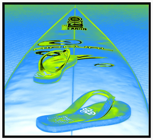
1) Took the image with flash after positioning the thongs in a surfing stance on the surf board in the lounge room. Used this room due to interesting carpet texture.
2) Post processed using two tones blue and green, adjusted shadows, midtown and highlihts then contrasted image a little to get an interesting (unique) effect.
3) Added a B/W border to finish off, hoping to provide a little depth and perspective for the image.
Interesting Fact: this used to be my brother in laws surf board; Former World Number (1) Air Show Surfer "Dave Reardon Smith" Dave gave me one of his old boards as a gift.
I was going for an image that you may find as a tag on a line of surf clothing or surf equipment range in retail?
Well tried to achieve this anyway.
Regards
Marc
Statistics
Place: 51 out of 271 Avg (all users): 5.5779 Avg (commenters): 7.2857 Avg (participants): 5.1776 Avg (non-participants): 5.8905 Views since voting: 1330 Views during voting: 394 Votes: 244 Comments: 20 Favorites: 2 (view)
I love the post-processing and the composition. I found your photo to be an eye-catcher and enjoy looking at it. After reading your notes on what you were trying to achieve, I'd say you did...and created a piece of art, not just a picture. Well done!
Glad to see your "unique" effect worked, I love the blue/green duotone and "logo" quality of your image. Like other commenters have said, sometimes post-processing backfires (mine for example, I thought high contrast would make my otherwise boring garage set-up more interesting) but I think you have done a fine job here in a rather "ordinary" challenge.
Not a bad finish at all, Marc. DPC as a rule does not respond well to posterized processing, which is what you did here of course. The composition and dynamics of the image overcame that negative bias to a considerable extent. Nice job!
this is cool well done balenced framing and great staging of the subject overall also i like the wide to tone boarder it works well here GL with this one





 Add photograph to your favorites
 Add photographer to your favorites

 Photographer found comment helpful.


