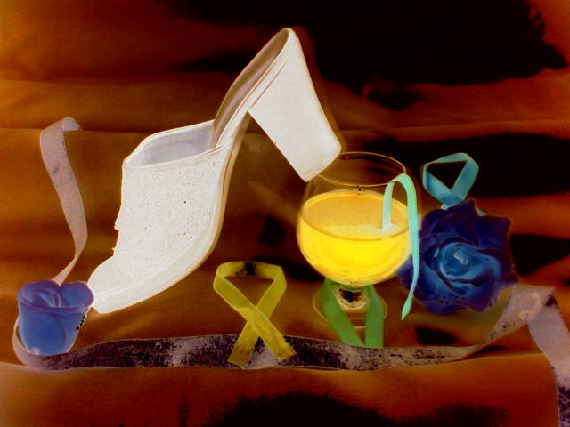
the inverted image here is cool and works well. the oranges are really hot tho and have very harch fades into the black spots. more even lighting and the inversion would've solved this, maybe...
Nice arrangement. Processing (curves) has resulted in interesting colors, but unfortunately also loss of detail, especially in the mule. Preserving the detail would be better.
I get the concept but it is too busy and the objects are distracting to the central subject. Also on my screen it seems oversaturated - however I realize you may have purposely done that to get the tone you wanted.
Wow - not sure what you did for processing, but its harsh. Also, I see a shoe, a drink, some roses, some ribbons, a surface with texture.... there is a LOT going on. I think your composition would work better with fewer supporting items.






 Add photograph to your favorites
 Add photographer to your favorites


