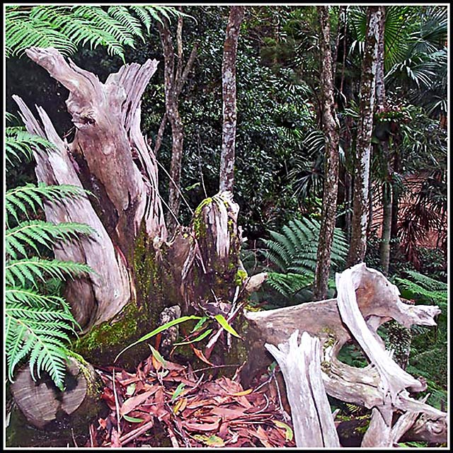
I thought this photo was pretty good for the square crop challenge. (I gave it a 5.) The powerful wooden forms on the left interact with the jumble of smaller wooden shapes on the lower right. There is another dynamic relationship between the green leaves in the left foreground and those at a distance in the upper right. The square shape reinforces these relationships--and thus makes this a good entry for the challenge.
So why didn't it do better in the challenge? I've looked at the original that you posted and I think that the basic problem is the lighting rather than over processing. You shot with fill flash but it was too strong to just be a fill for the other light. The wooden shapes on the lower right are very harshly lit with highlights that are almost burned out and rims of dark shadows behind them. You have lost the nice texture that is apparent in the trunks on the left.
This is supposed to be an ancient forest. The natural light in a forest is filtered through the trees and is usually very soft. The light from the flash destroys the forest mood and makes the image look very unnatural.
You also used fill flash on your Odd Couple image. Please also read my comment on it.
As mentioned before, it looks oversharpened - makes it seem like a cardboard cutout to me. But I really like the earthy colors, and composition, except for the tree in the middle of the background "growing" from the stump in the middle. I think that takes away some of the depth, adding to the cardboard cutout look.
Edit:
Forgot to say that if you adjusted the angle so the tree doesn't seem attached to the stump, the stump would probably be at a less flattering angle. If that'd be the case, I think what you have done would be the better choice.
An interesting scene, but lacking a real focal point. The contrast could be improved also (the image looks a little oversharpened and is washed out in some parts)
Interesting photo, I like the subject but there is no real focal point! The stump is interesting but your eye is not drawn to anyone spot in the photo and when it does rest on something it is not that exciting. Would be good if it had softer lighting.
Is a lovely picture. I think it could have benefited from reduction of brightness and a little added contrast. This would take care of some of the flare on the log.
Well filled frame, and good DOF for square crop,the coloring works for the title,a little dodging on the trees in the background,would draw the viewer further into the image,the image is well taken....10






 Add photograph to your favorites
 Add photographer to your favorites

 Photographer found comment helpful.


