update: 19Aug2009
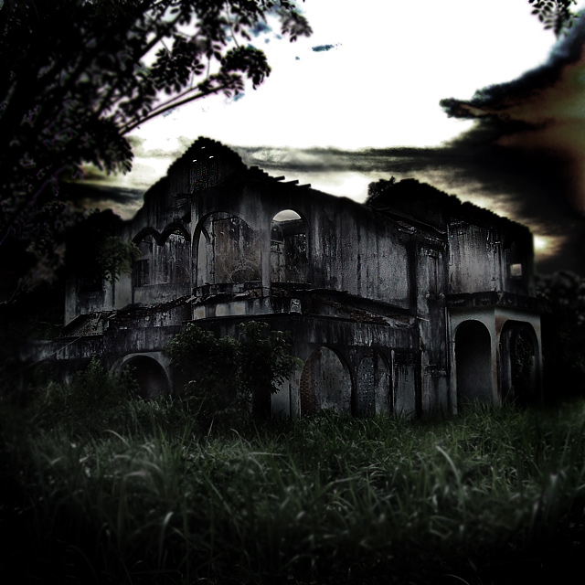
revisited the site to locate the building. sadly it is gone. in fact, the entire area had been bulldozed off for building new roads. what a shame. should have gone into the house and see if i could contact the spiritual world or something then. oh well, i'll know what to do the next time should i find such a building again!
Statistics
Place: 91 out of 369 Avg (all users): 5.9132 Avg (commenters): 6.9444 Avg (participants): 5.7482 Avg (non-participants): 6.2000 Views since voting: 1765 Views during voting: 310 Votes: 219 Comments: 22 Favorites: 2 (view)
BRILLIANT work! Completely amazing! An awesome building. Your post-processing is stunning. The tones and dull colors give a very powerful, spooky atmosphere.
from the eyes behind the portrait of the Critique Club
AH hell, I'm not sure which approach to take. On one hand I completely loath this over-processed supposedly 'creepy' kind of stuff. You know? Take an image of something broken and dodge all hell out of it and call it 'gothic' or 'grunge' or whatever the term of the moment is. It seems to betray an urge toward the darker end of the war photographers' art; well, damn it, get yourself a ticket out to Kabul and do the real thing. But it also, in only a small way, but nevertheless of significance, betrays the real work of those guys, of Norfolk, Nachtwey, McCullin and the rest, who did it to bring those things to our notice and did so more profoundly than any writers.
On the other hand, of course, it's just fun - just making a larking-about dark image, not taking yourself too seriously: and there's something here that betrays a smile as it is made - perhaps the only real moment of inspiration in the image, which is that out-of-focus foreground framing - beautifully done. It adds also a touch of the impression of hyper-shappow depth of field, making the house appear like a model.
The burnt-out sky is kind of a shame: whilst it adds a sense of lurking darkness to the house, it's perhaps such a blat of whiteness that its overall effect is to drag the eye away from the subject. The tonality is fine, though I would think you could have brightened the whole thing without losing the intensity of it and just made it sit a little happier for those with dark screens already - might have won you the few scores to get into the 6's, which it would be my feeling is about what this deserves.
Technically accomplished stuff. Whether or not I think it worth thee effort is beside the point, maybe.
What a place, you want to run away, but at the same time, you really, really want to get closer and explore. What a catch, good composition, lovely colours in the absence of colour, hope that makes sense. 9
I love your idea, but the building is a bit too dark for me - I can barely tell the shape... a little lighter (or less contrasty) would have been better imo without losing the feel... also, as a side note, given that this was an advanced challenge I might have selected the top left and gotten rid of the purple fringing around the leaves
This scene has great potential. I think that different lighting, perhaps a different time of day, would help. Also, more of a silhouette, and no foreground grass. The out of focus tree is distracting. But that building is terrific!
Love the concept, but find the tone a tad too dark. I can fully appreciate the fact the the darkness is what makes the image, but there is not enough distinction between the various artifacts.
I like the spooky darkness of this but because of the square crop, it feels a bit tight in the crop department. Maybe back up so that there is more area around the house, at least on one side.






 Add photograph to your favorites
 Add photographer to your favorites

 Photographer found comment helpful.


